Each flow can have its own user interface.
Tap the Design tab to see, edit and interact with it.
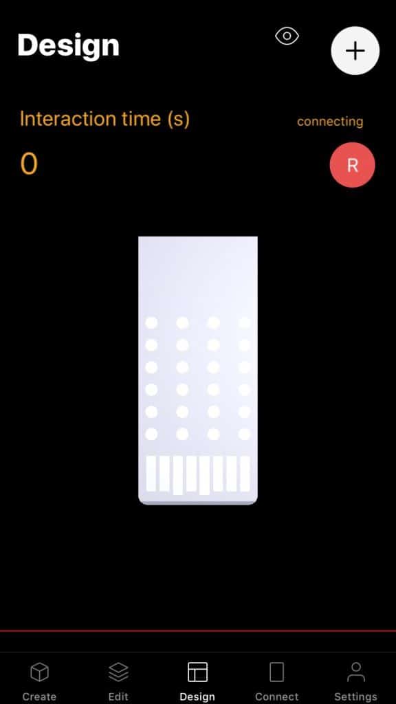
The design view consist of UI components such as buttons, sliders, switches, text labels and more.
Each UI component is represented by a patch. Tap the + button in the design view to add UI components directly to the design view.
Tap the button with an eye icon to switch to edit mode.
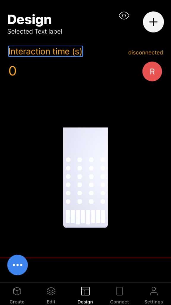
In edit mode, select a component and move it around to change its position.
On some of the UI components you can change the width and height.
When a component is selected in edit mode, a blue button appears at the bottom left of the design view. Tap it to see the edit view of that UI component / UI patch. All the UI patches are contained in a group called Design page.